Redesigning Prospa's Business Banking Webapp

Prospa WebApp
WebApp
2023
About
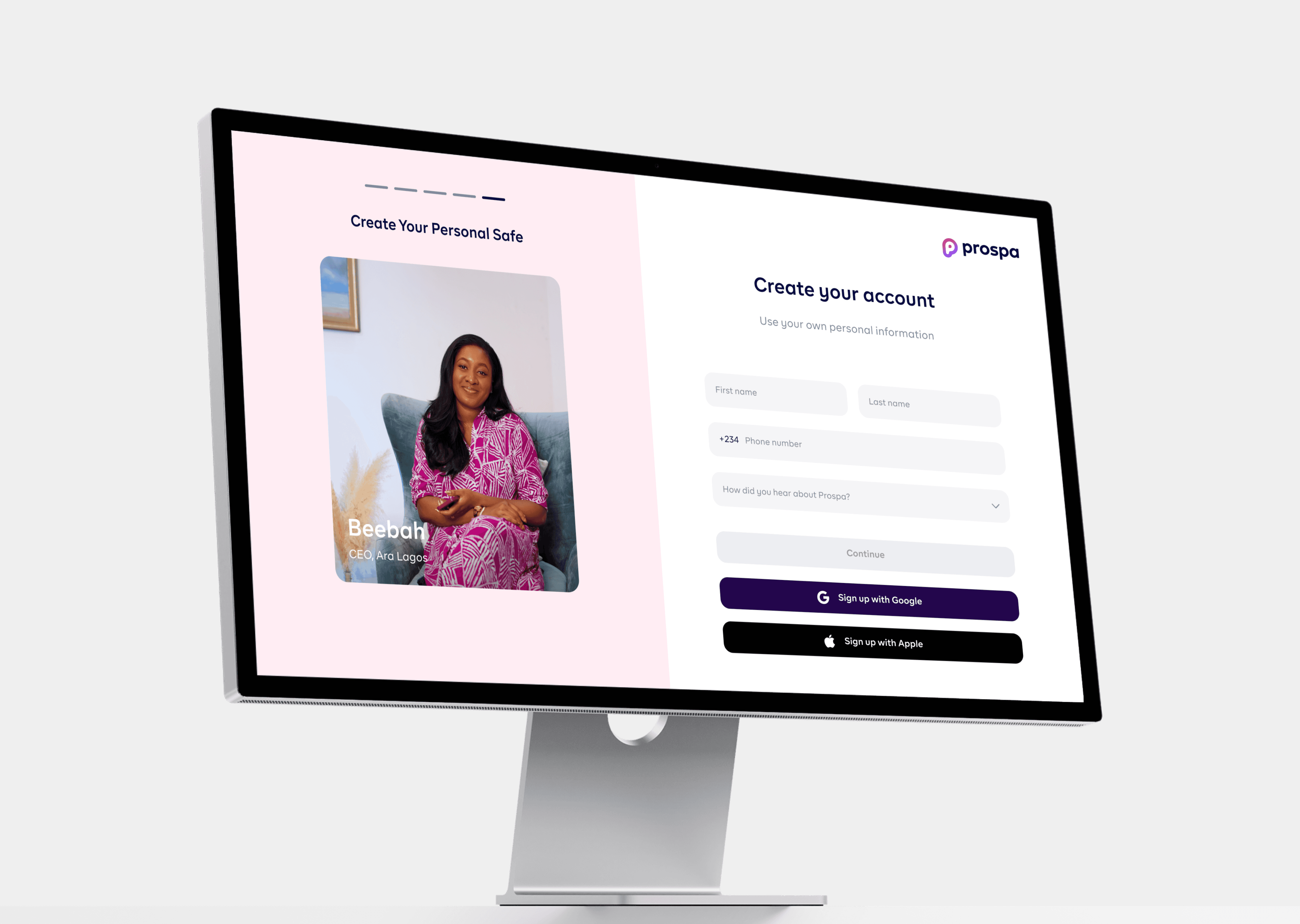
Prospa recognized the critical role of user experience in its web application's success. However, the previous web dashboard presented significant usability challenges and lacked a cohesive visual identity. This redesign aimed to not only address usability issues but also to implement a robust design system to ensure consistency and scalability across the platform.
My Role
As a pivotal member of the design team, my responsibilities included: Collaborating with other designers on the redesign effort, ensuring alignment with the overarching design system. Collaborating with cross-functional teams to gather insights and requirements.
Crafting intuitive and visually appealing user interfaces for each feature and overseeing the implementation process to maintain design fidelity.
Problem Discovery and User Feedback
What were we trying to solve with this redesign?
What did we intend to achieve?
Improve User Experience
Enhance the overall usability of the web application, making it more intuitive and user-friendly for both new and existing users
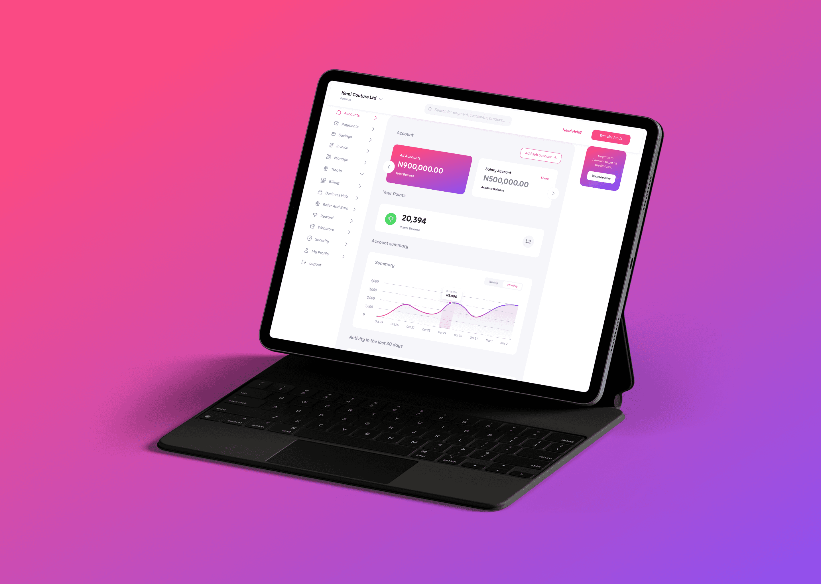
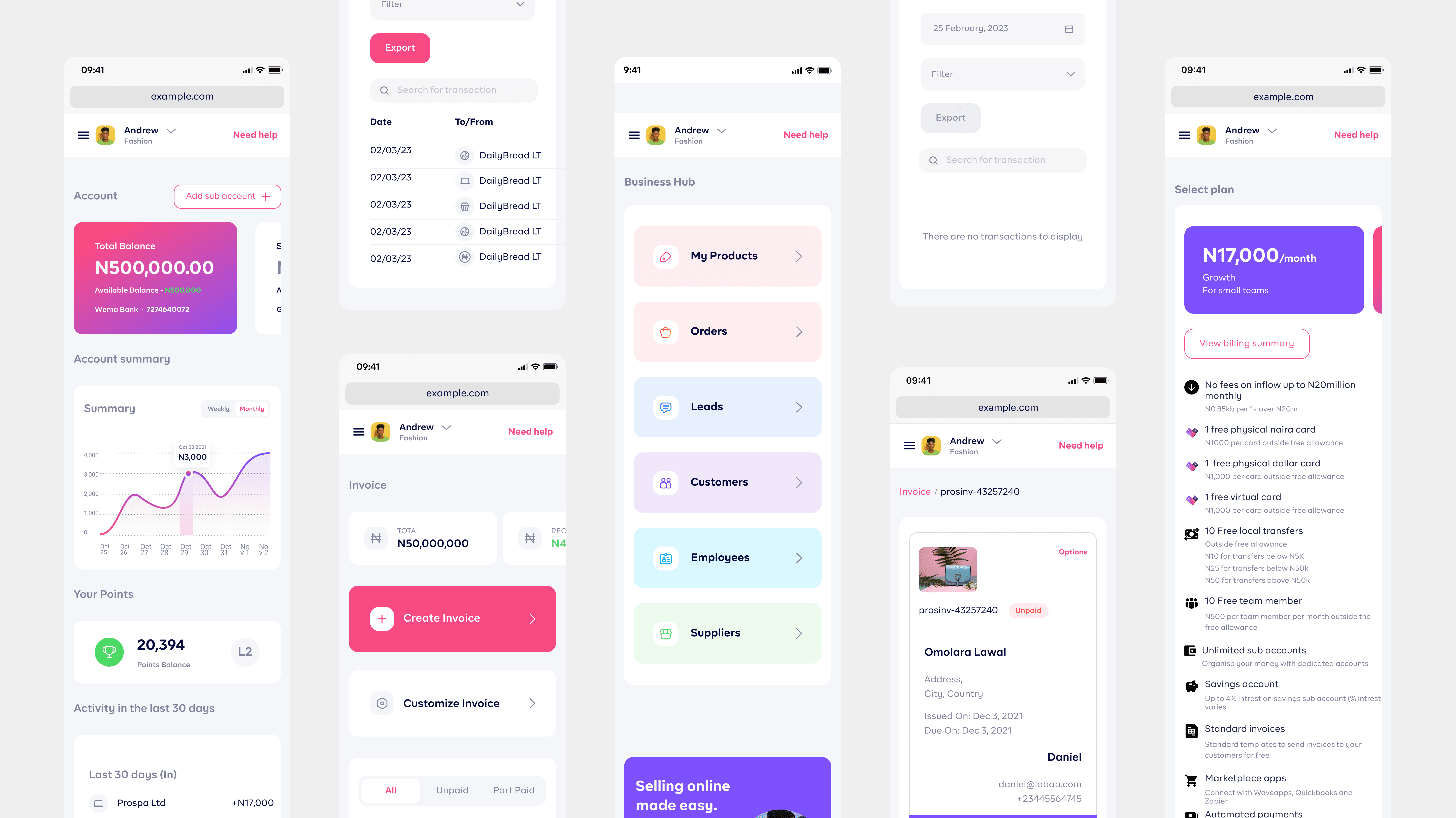
Mobile Responsiveness:
Ensure that the redesigned application is fully responsive, providing an optimal experience across various devices and screen sizes
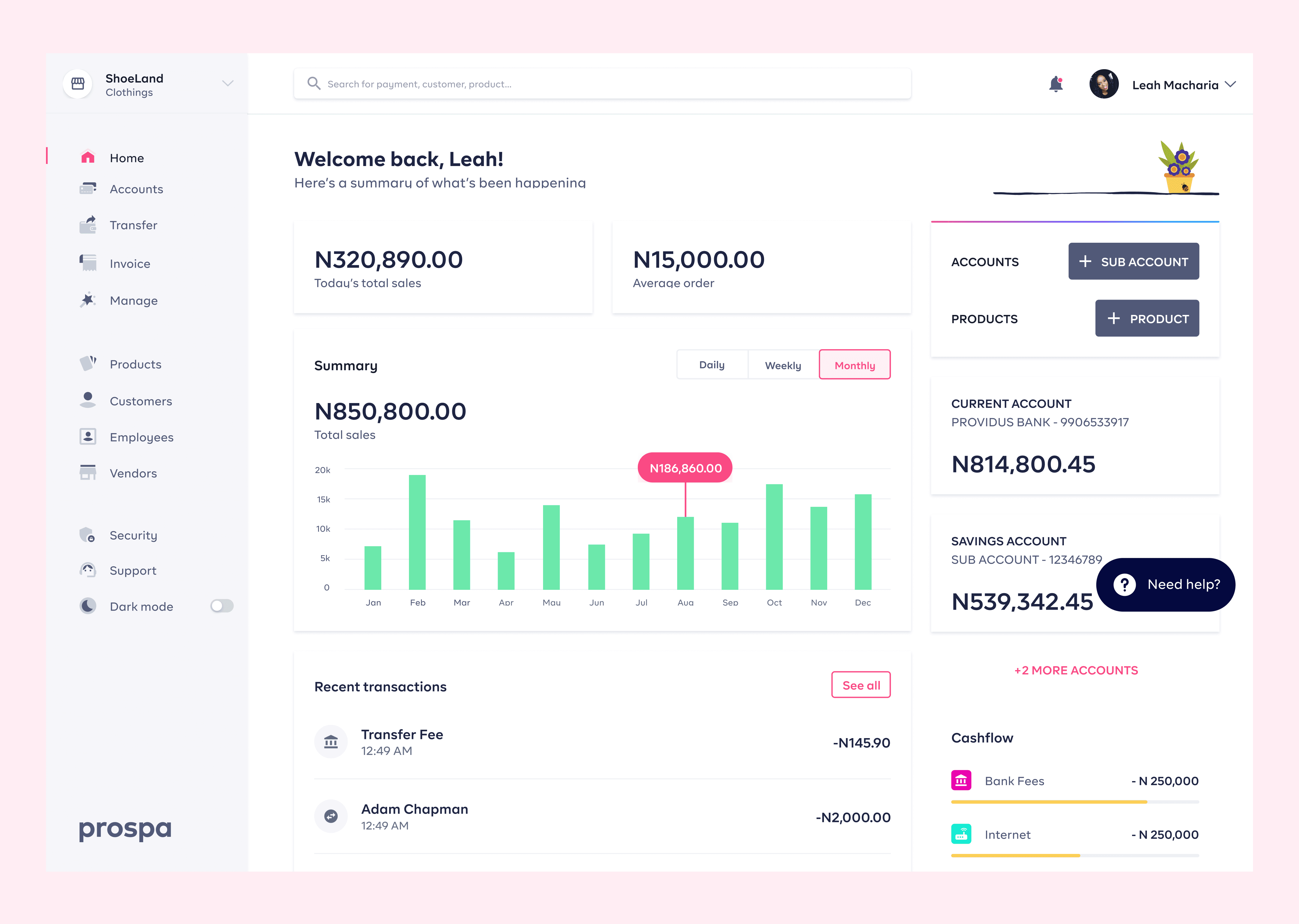
Enhance Feature Visibility
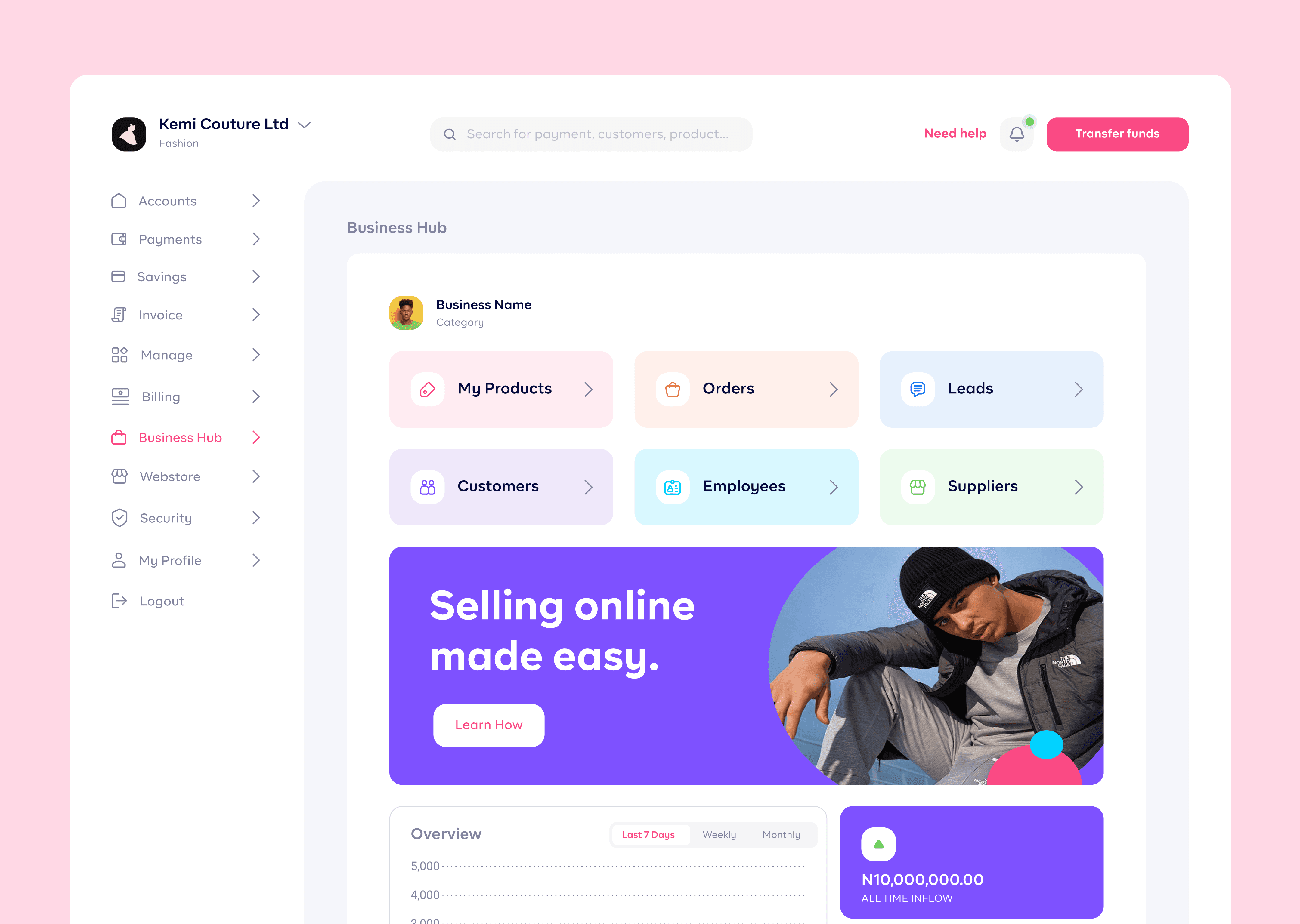
Improve the visibility and accessibility of key features, including Accounts, Payments, Savings, Invoice, Manage, Billing, Business Hub and Webstore
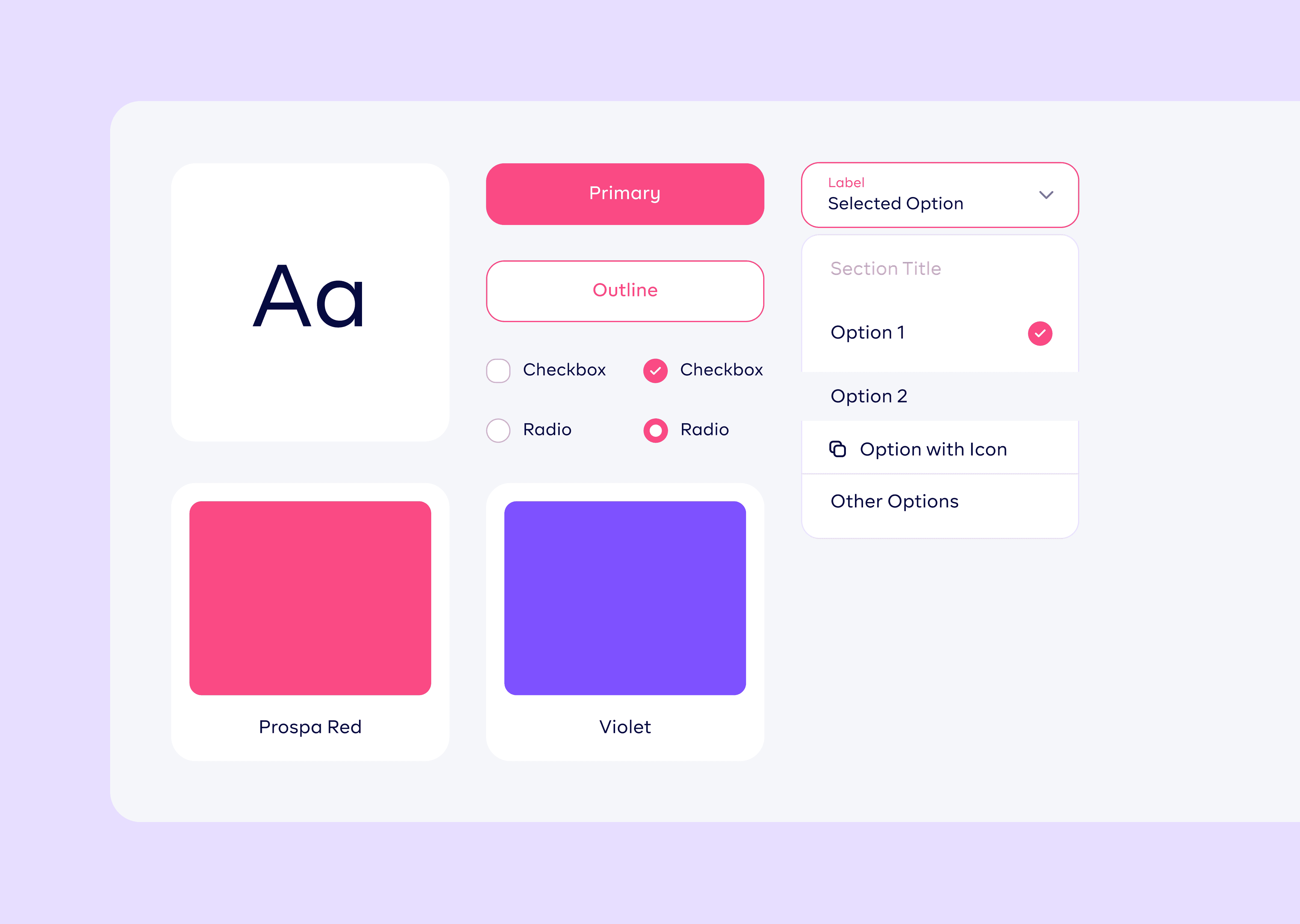
Design System Development
Collaborated with the design team to develop a robust design system, establishing standardized components, typography, color schemes, and interaction patterns
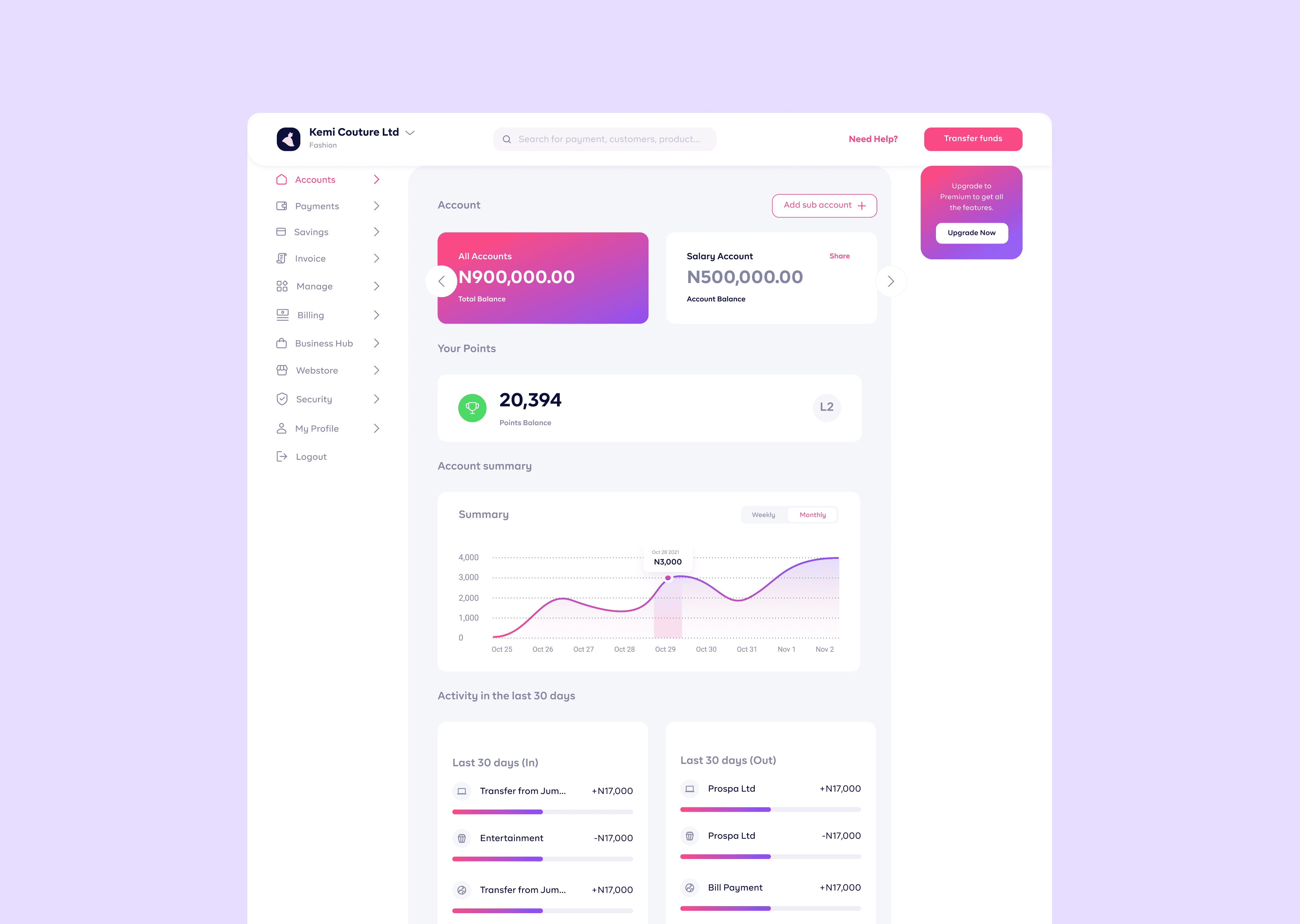
Accounts
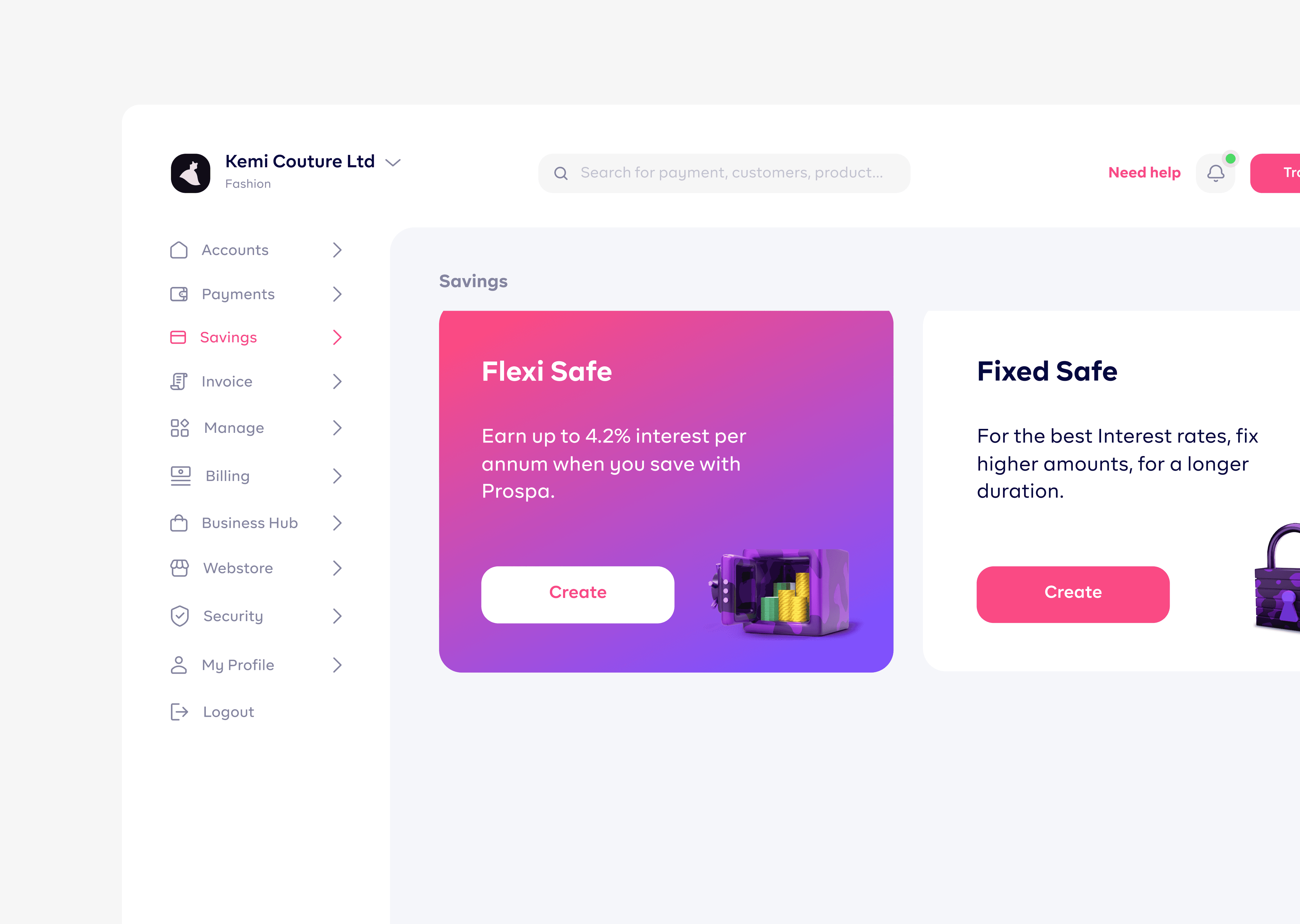
Savings
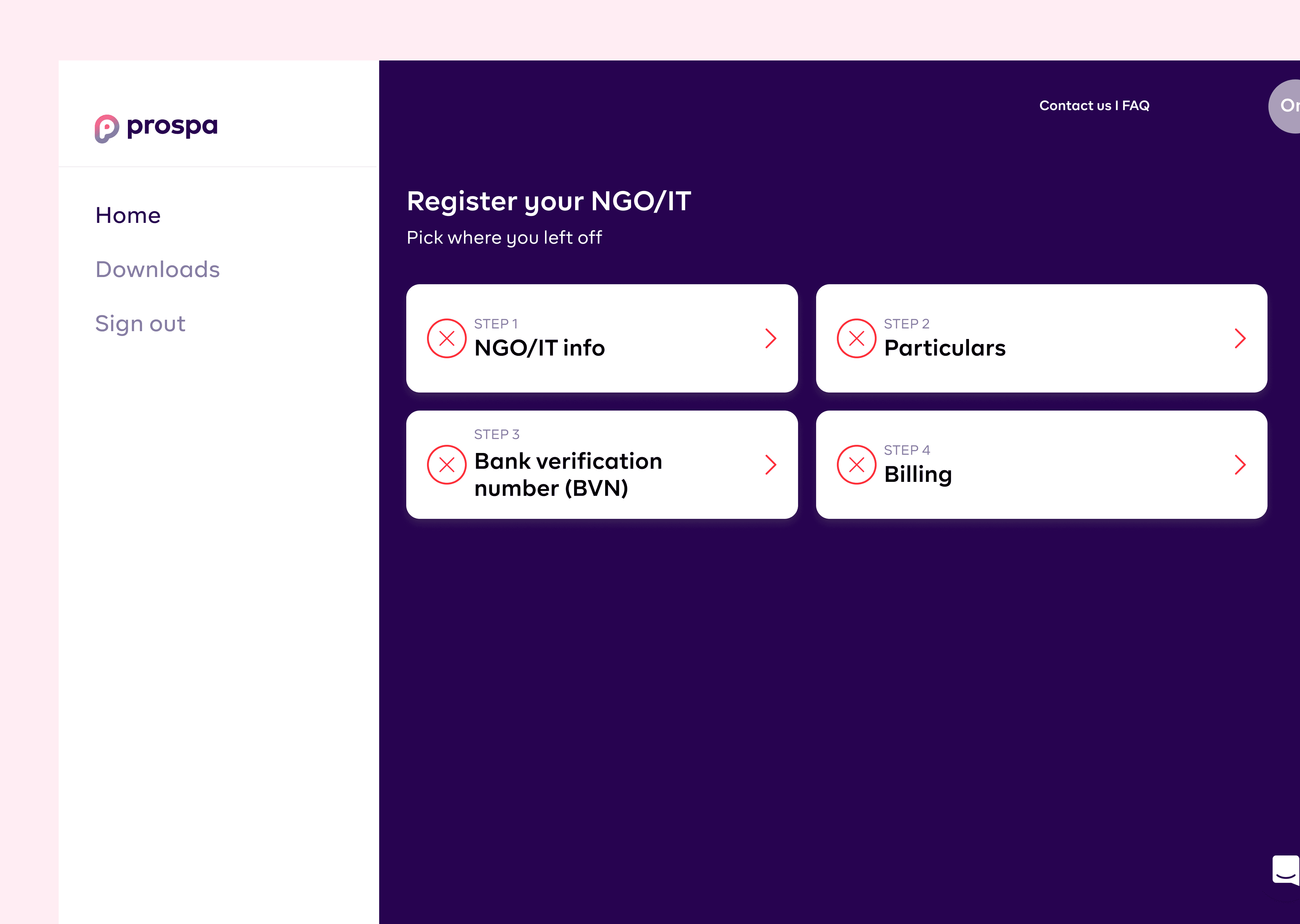
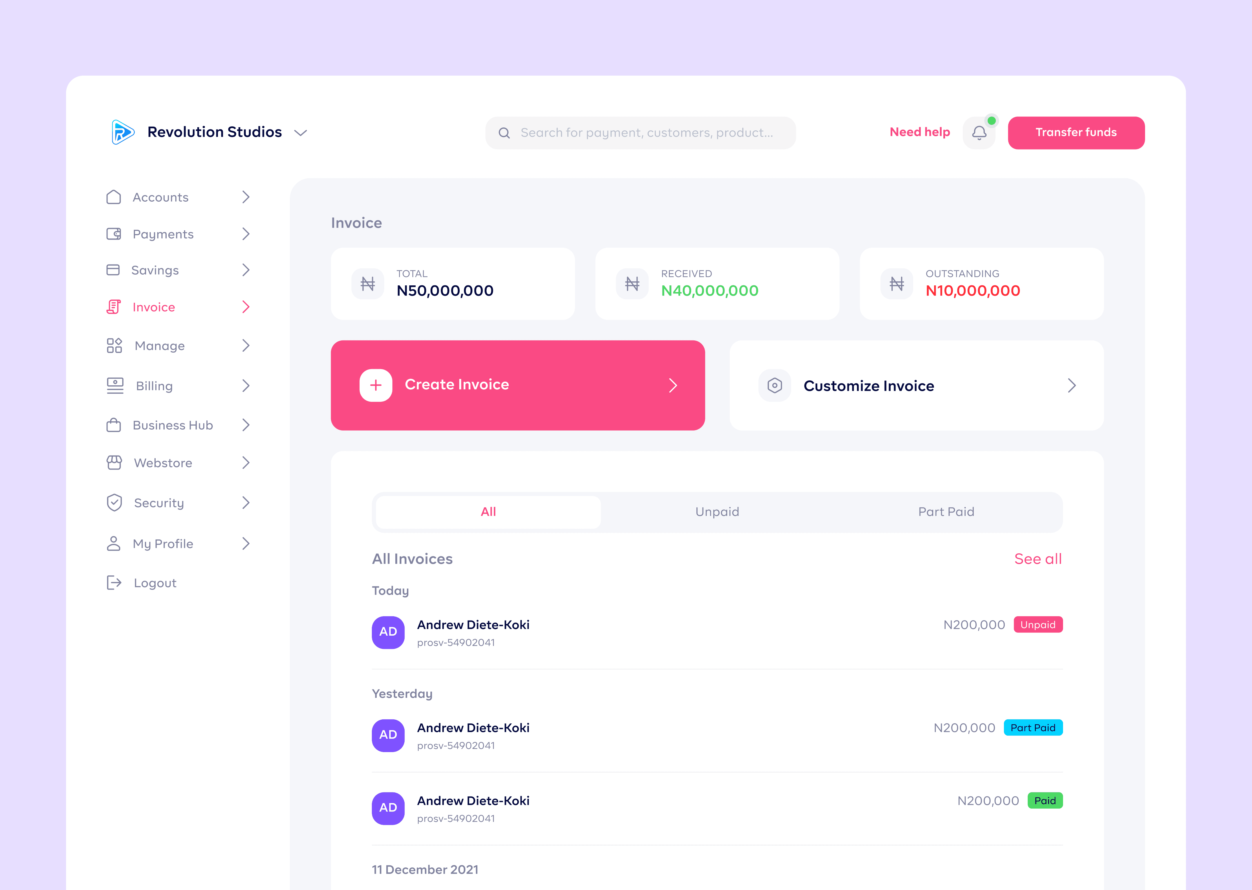
Invoicing and Business Hub
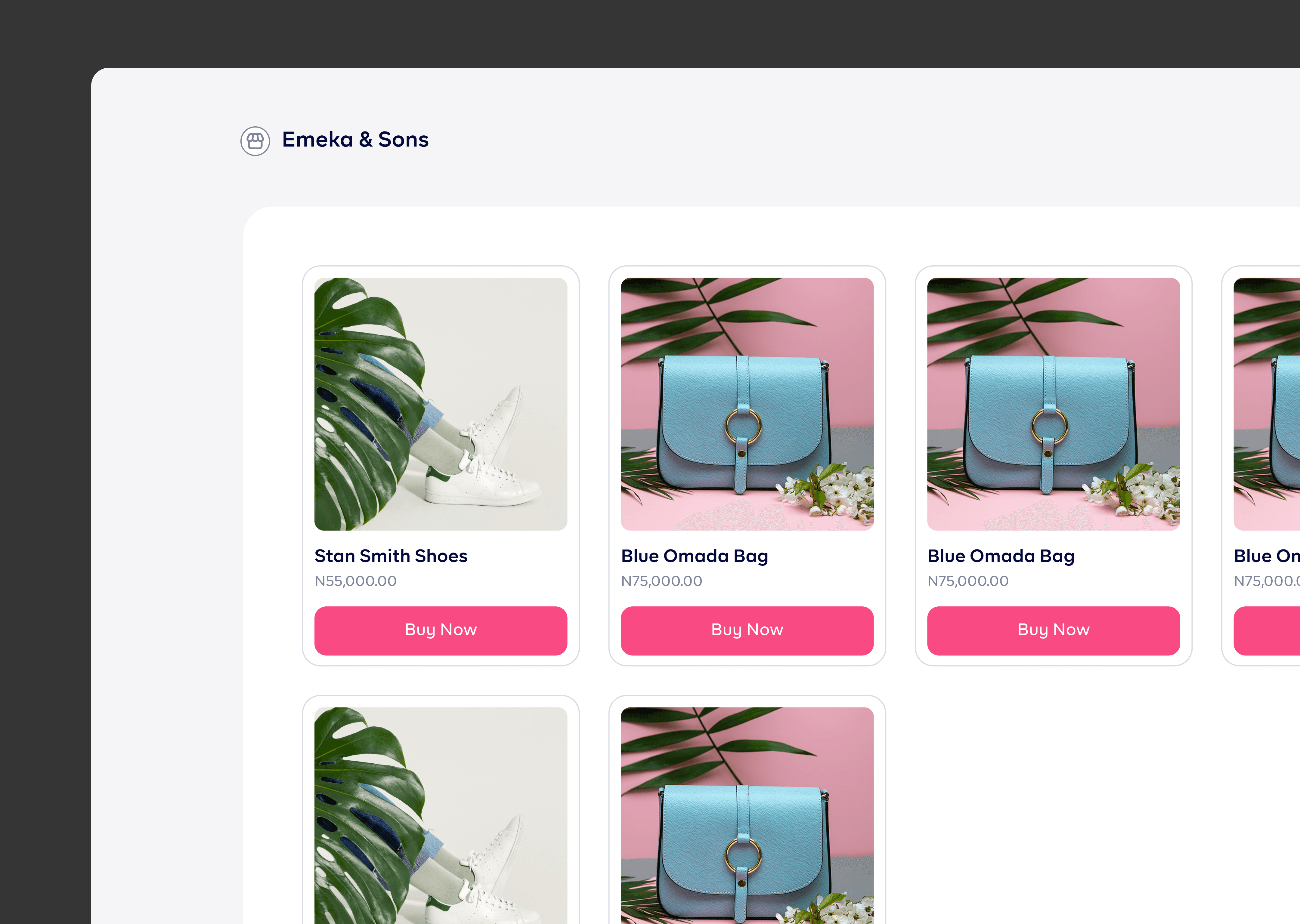
Webstore
Mobile Responsiveness
Feedback and Iteration
I Iteratively refined the designs based on feedback from stakeholders, ensuring a balance between visual appeal and usability.
Challenges
Feature Complexity
Addressing the challenge of designing a visually cohesive interface for diverse features with varying complexities
Maintaining Consistency
Ensuring that the design system maintained consistency across all features, aligning with the overarching brand identity
Results & Business Impact
Increase in Overall user satisfaction score
Reduction in navigation friction
Increase in user engagement levels
Design Impact
Scalable Design System
The implemented design system allowed for scalability, making it easier to introduce new features and maintain visual consistency
Iterative Improvement
Established a process for continuous improvement, using user feedback and data analytics to inform ongoing design iterations