Building Orion - An Open-Source Design System
Project
Project
Orion
Platform
Platform
Design System
Year
Year
2022
About
Orion, my ambitious venture into the world of open-source design systems, seeks to provide a comprehensive toolkit for creating beautiful and consistent applications. This project aims to explore the intricacies of developing a design system, emphasizing collaboration, efficiency, and community-driven innovation.
Orion, my ambitious venture into the world of open-source design systems, seeks to provide a comprehensive toolkit for creating beautiful and consistent applications. This project aims to explore the intricacies of developing a design system, emphasizing collaboration, efficiency, and community-driven innovation.
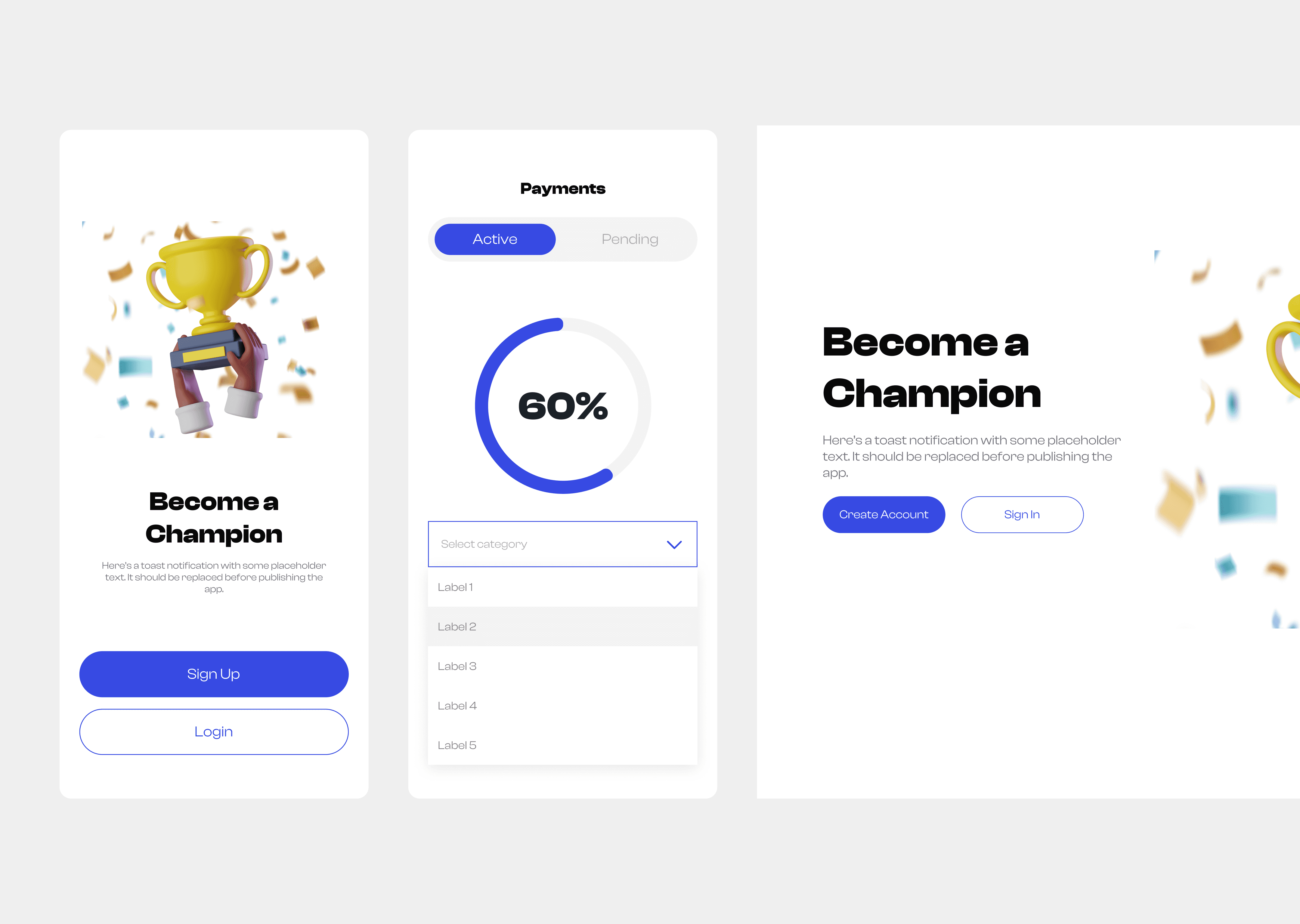
Orion is an open-source components library that was developed for creating beautiful Mobile and Web apps.
Orion is an open-source components library that was developed for creating beautiful Mobile and Web apps.
Orion Design System ✼
Colours
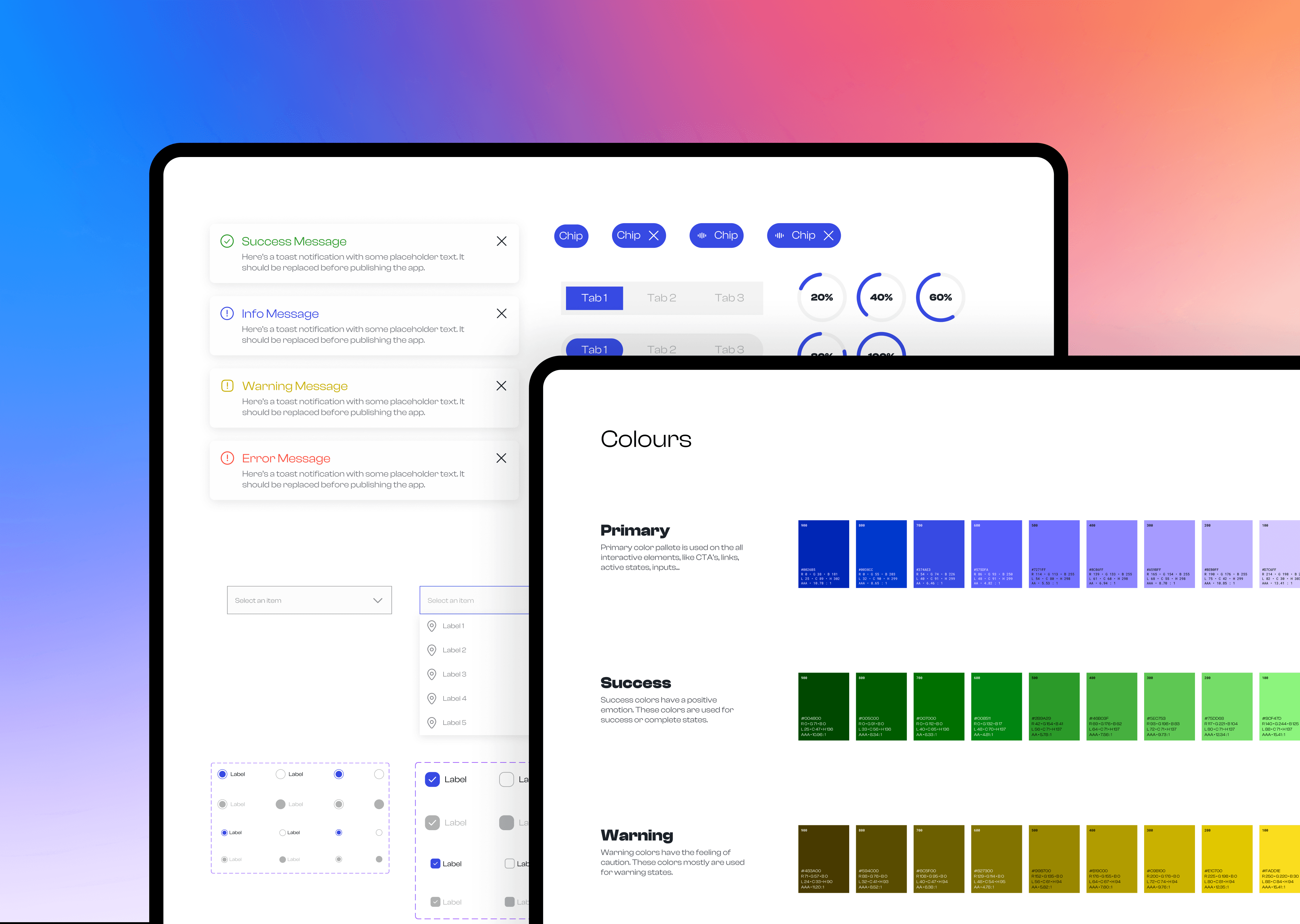
The Orion Design System has a meticulously crafted color palette, featuring distinct hues and shades tailored for clarity, coherence, and accessibility across all interfaces.
The Orion Design System has a meticulously crafted color palette, featuring distinct hues and shades tailored for clarity, coherence, and accessibility across all interfaces.
Typography
Orion uses Clash Display font created by Indian Type Foundry. It is free for commercial use. Orion provides comprehensive typography guidelines tailored for both mobile and web platforms. These guidelines ensure consistency and readability across diverse screen sizes and resolutions
Orion uses Clash Display font created by Indian Type Foundry. It is free for commercial use. Orion provides comprehensive typography guidelines tailored for both mobile and web platforms. These guidelines ensure consistency and readability across diverse screen sizes and resolutions
Components Library
Buttons
Buttons
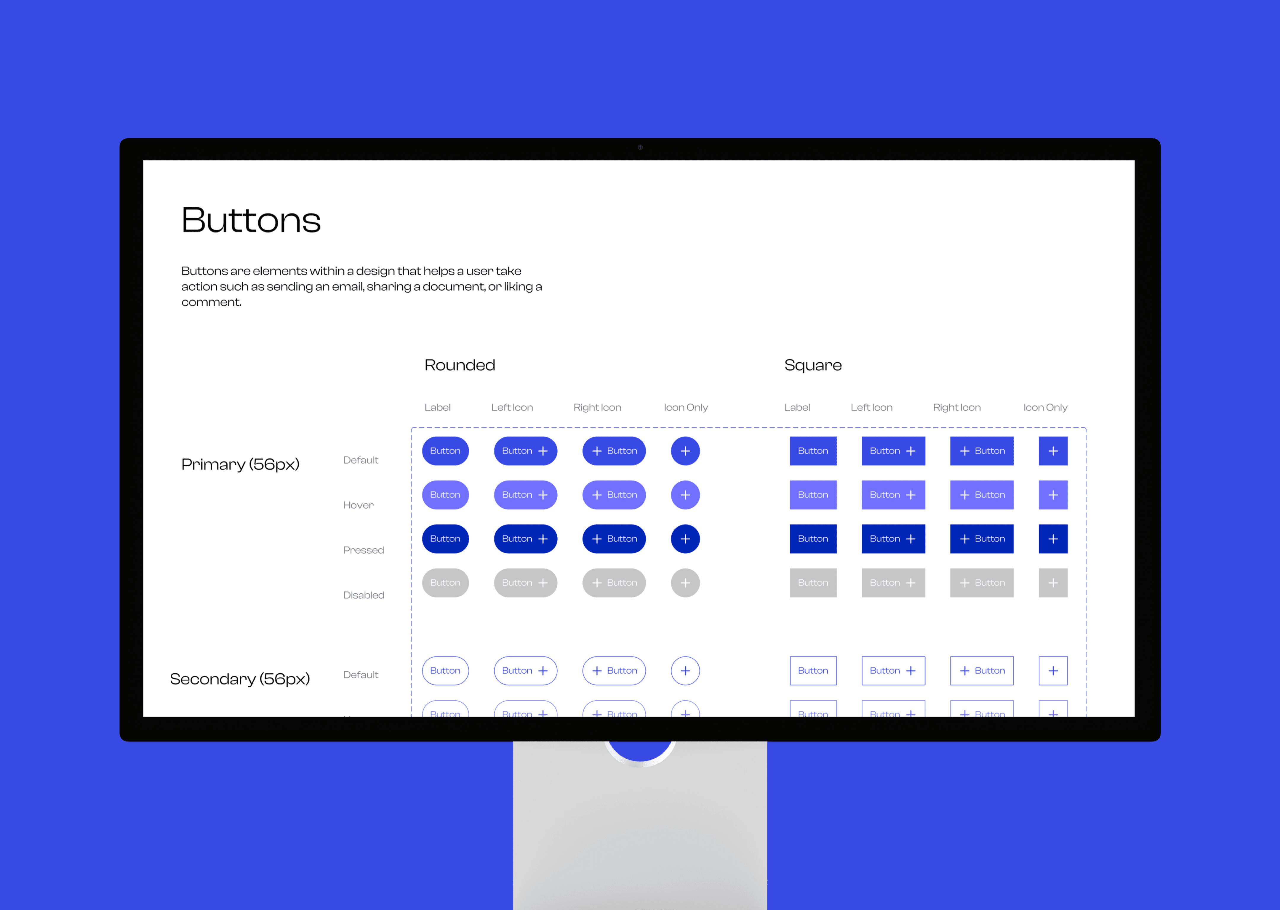
Buttons exhibit various states, with the prevalent ones being default, active, hover, disabled, and sometimes a loading state. Additionally, there are three distinct button types: Primary, Secondary, and Tertiary. The assorted states can be observed below.
Buttons exhibit various states, with the prevalent ones being default, active, hover, disabled, and sometimes a loading state. Additionally, there are three distinct button types: Primary, Secondary, and Tertiary. The assorted states can be observed below.
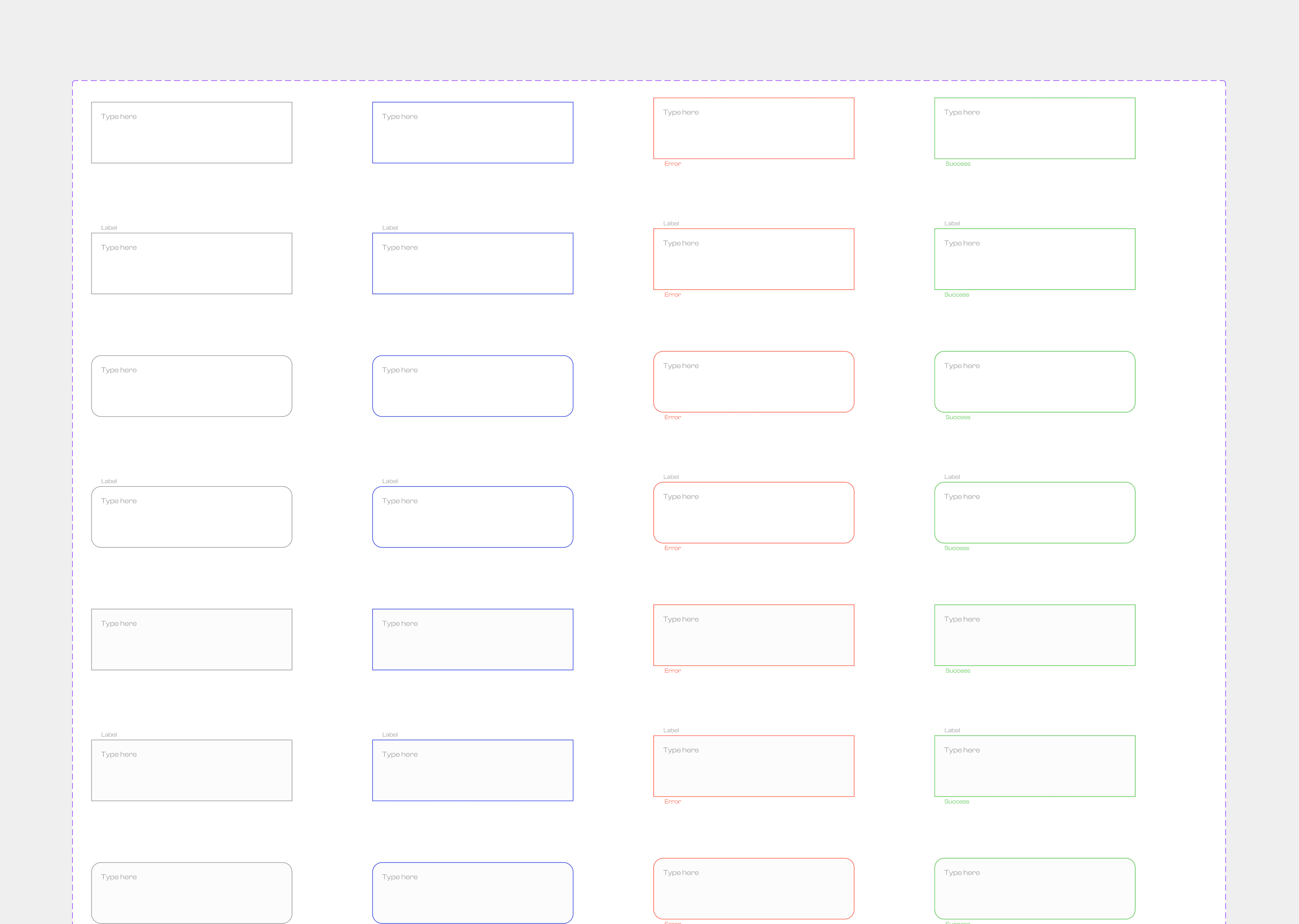
Input + Text Fields
Input + Text Fields
Input + Text Fields allow users to input text, numbers, or other data. These fields typically appear as rectangular boxes or areas where users can type or select information. Input/text fields serve various purposes, such as filling out forms, conducting searches, entering login credentials, or composing messages.
Input + Text Fields allow users to input text, numbers, or other data. These fields typically appear as rectangular boxes or areas where users can type or select information. Input/text fields serve various purposes, such as filling out forms, conducting searches, entering login credentials, or composing messages.
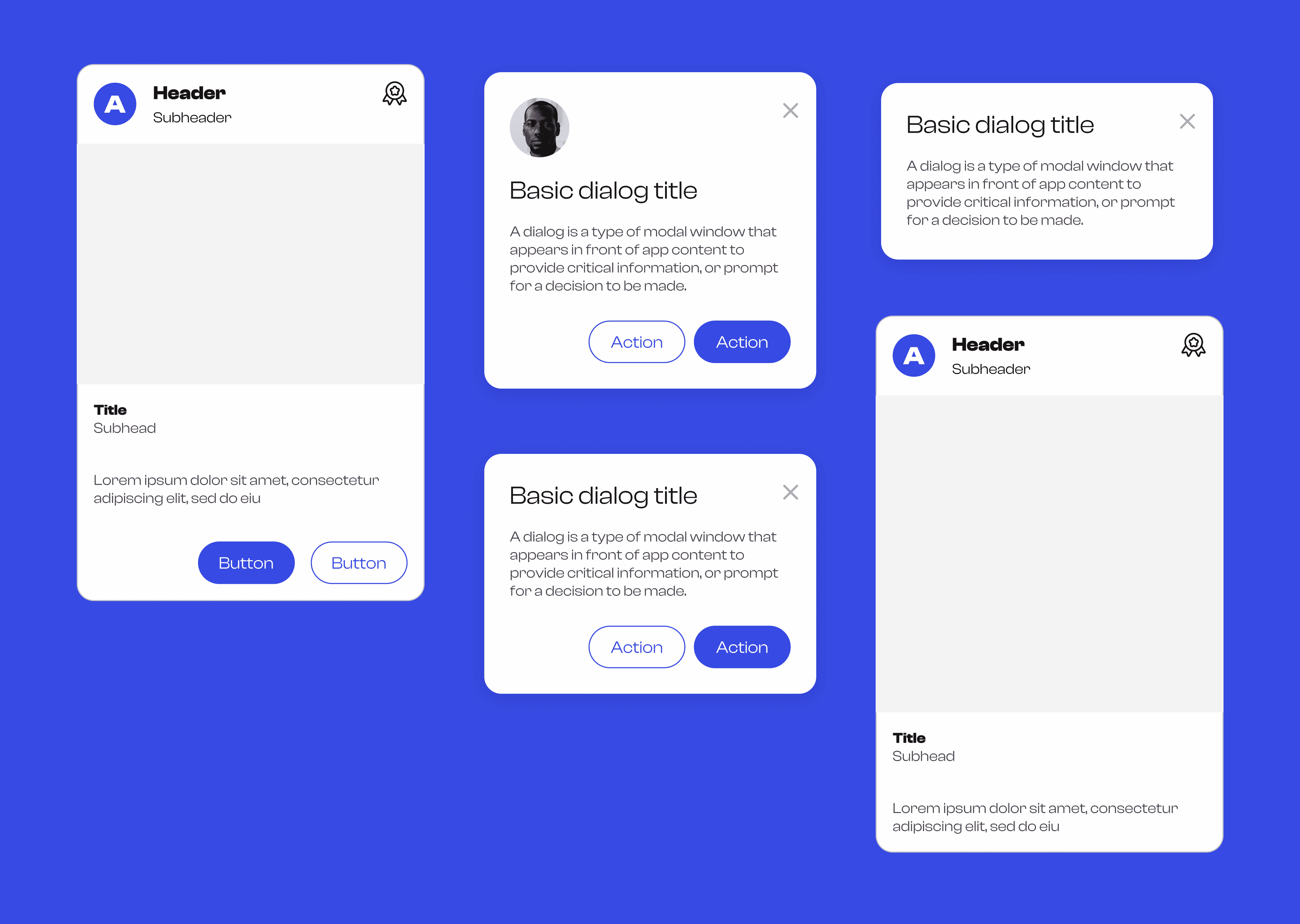
Cards + Dialogs
Cards + Dialogs
Cards are a user interface design pattern used to organize and present information in a visually appealing and digestible format. They typically consist of a contained rectangular or square-shaped area that displays related content or functionality. Cards can be seen across various digital platforms, including websites, mobile apps, and social media feeds while Dialogs are pop-up windows or overlays that appear on top of the main interface to convey important messages, request user input, or prompt actions. They temporarily interrupt the user's workflow to draw.
Cards are a user interface design pattern used to organize and present information in a visually appealing and digestible format. They typically consist of a contained rectangular or square-shaped area that displays related content or functionality. Cards can be seen across various digital platforms, including websites, mobile apps, and social media feeds while Dialogs are pop-up windows or overlays that appear on top of the main interface to convey important messages, request user input, or prompt actions. They temporarily interrupt the user's workflow to draw.
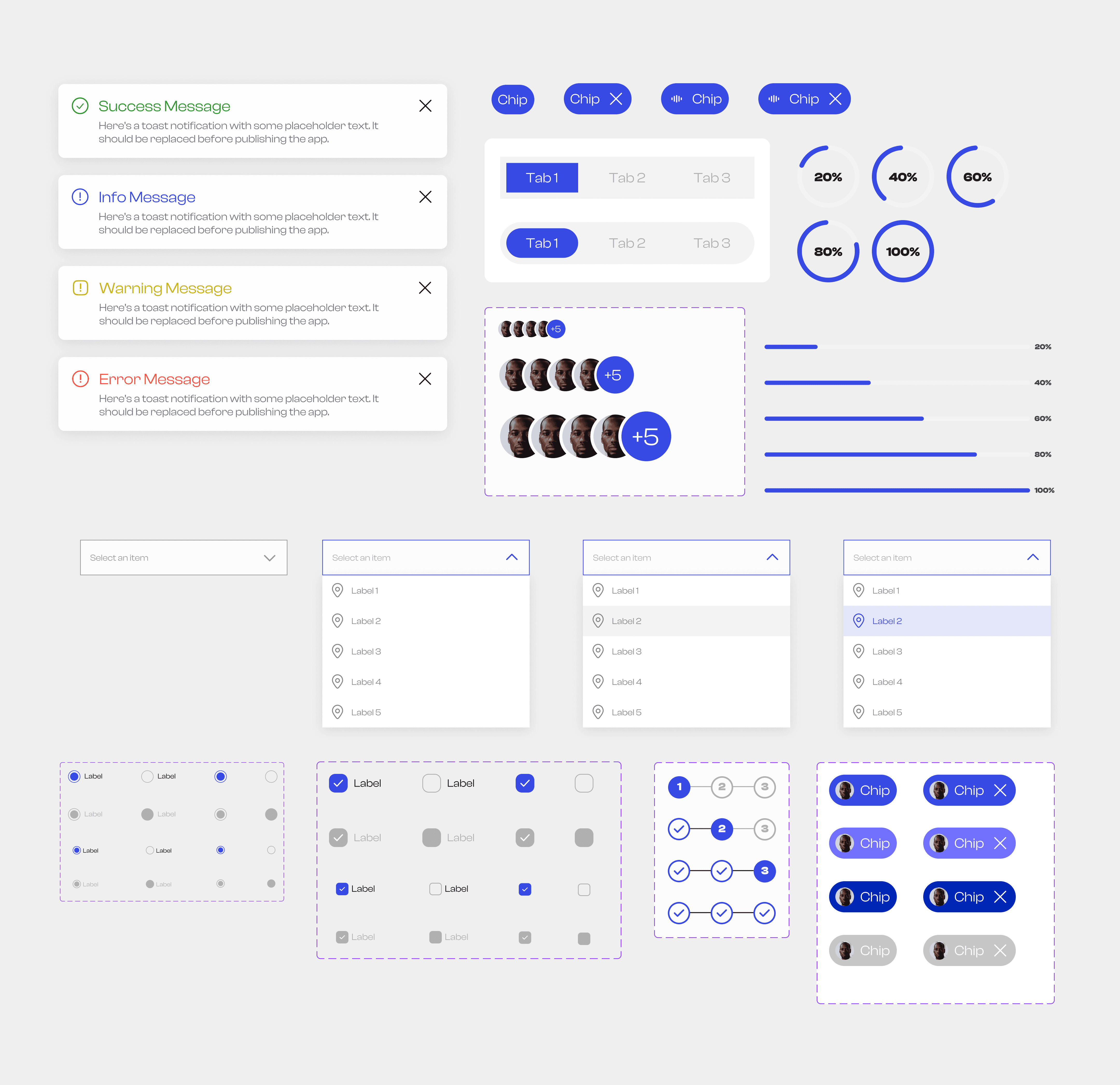
Other Components
Other Components
Other components on the V1 of the design system include Toggles, avatars, radio buttons, check boxes, icons, progress bars, dropdown menu, alerts, tabs and chips
Other components on the V1 of the design system include Toggles, avatars, radio buttons, check boxes, icons, progress bars, dropdown menu, alerts, tabs and chips
Next Steps
Next Steps
Orion will continue to be updated with new features, improvements, and optimizations to ensure its relevance and effectiveness in the evolving landscape of design systems. Access the V1 here
Orion will continue to be updated with new features, improvements, and optimizations to ensure its relevance and effectiveness in the evolving landscape of design systems. Access the V1 here